
Local Grub
Food Ordering App
exclusively for independently owned restaurants.


Overview
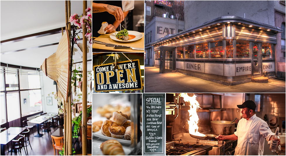
Local Grub is a food website and app exclusively listing independently owned restaurants for food lovers who want to experience unique delicacies, flavors and culinary fineness.
The reason I chose to create Local Grub is because of my personal experiences as a customer of independently owned local restaurants. I often order food from restaurants that sell authentic ethnic cuisines and there are certain problems I usually face.
Roles & Responsibilities
UI/UX Designer
(Case Study Project for Google UX Specialization):
User Research, Ideation, Interaction, Visual Design, Wireframing, Prototyping & Testing
Duration: April - June 2021
Tools: Google Docs, Google Slides, Adobe Illustrator & Figma
Problem
There is no access to a one stop platform to order food from independently owned restaurants for food lovers who want to experience unique local flavors and culinary fineness.
Popular food delivery apps and websites have no specific option to filter a list of independently owned local restaurants. These restaurants are listed with big chain restaurants and fail to convey the uniqueness that they offer. Independent restaurants often do not have websites, and if they do, they are not well equipped to take online orders. The problem while calling the restaurants to place an order is that if the phone line is engaged during rush hour, waiting or retrying till the call is answered gets very frustrating.
Solution
Local Grub makes it easy for the customers to order from their favorite independently owned restaurants without browsing through unwanted food options on usual food ordering apps and websites.
This platform is a one stop solution to order delivery & pickup from local restaurants for food lovers who want to experience unique food and local flavors.
Design Process
In order to determine the problem I was trying to solve, I conducted foundational research which included empathizing with the users, POV survey and a competitive analysis to know what the users want. Further, I defined the user problem by interpreting my research findings in to user personas, user journey maps and determining the value proposition.
Then I began the ideation process to find potential solution options by making different versions of basic userflow, storyboards and several paper wireframes sketches with Crazy 8s method. The next step was to design the low fidelity wireframes and prototype of the app and website's key flow and functionalities.
I decided to conduct a test with the prototype to validate usability and gather feedback to further ideate. After synthesizing the feedback and implementing it into the design I completed the final visual mockup screens.
Learn about users through research and empathize
Testing reveals new problems that redefine problems
Tests create new ideas for the project
Tests help improve the design
1
Empathize
2
Define
3
Ideate
4
Test
5
Design
1
Empathize
POV Survey
Based on foundational research on existing available data it was determined that independently owned local restaurants are growing in popularity due to changing user preferences.
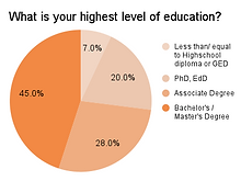
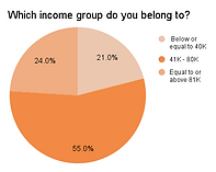
I decide to conduct a POV (point of view) survey through a survey website in order to empathize and get an insight of the user's preferences. A total of 30 people in the age group of 18 - 65 years participated and the questions were about their lifestyle, food preferences and ordering tendencies.


Key Insights

100%
Feel frustrated when they call to place an order and the line is engaged

77%
Find it difficult to get a list of independent restaurants on regular food ordering apps and website

59%
Travelers struggle to find locally famous restaurants and delicacies
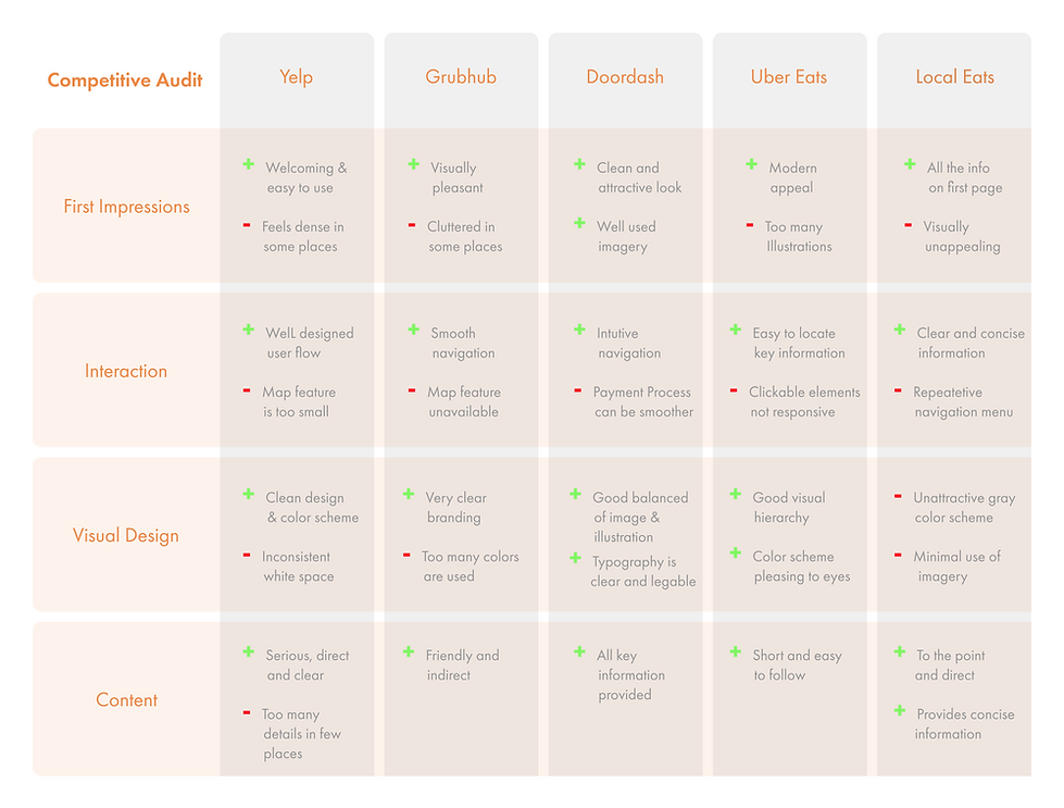
Competitive Analysis - Mobile Apps
In order to determine the right direction for Local Grub, I wanted to understand how the current food ordering apps are addressing the user needs, particularly for ordering local food . So I conducted a competitive audit. While going through this analysis I decided to change the name of my project to Local Grub which I previously named Local Eats since I realized it already existed.
2
Define
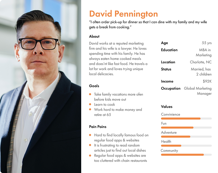
User Persona
Based on the POV survey and the Key insights I defined two main user groups to empathize better with them in order to attain the goal.

Paper Wireframes and Ideating

After completing the personas I began sketching the ideas using crazy 8s,user story boarding and few other methods to get a clarity of what would best suite the user needs. The rapid ideation helped me to experiment different design solutions before starting final design development.
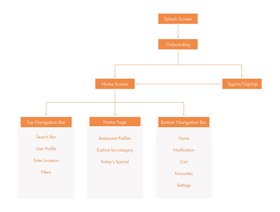
Site Map
Following the sketching and ideating I decided to present all the required information to the user in an easy and uncomplicated way.
Screen Flow
Based on the information architecture, I made the basic screen flow to gain clarity of how the final product would look to a user. I made the screens using Figma which helped me decide whether my final vision of the app would align with goal or not.

3
Ideate
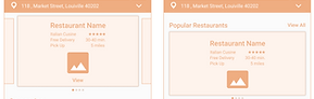
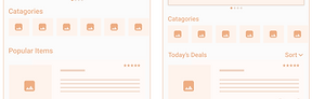
Mid-Fi Wireframes
Moving forward I created mid-fi mockups and prototype of the ordering and checkout process with Figma using the grid system and proportional spacing.

Home Screen
Restaurant Profile
Order Confirmation Screen
Payment Screen
Order Tracking Screen
Usability Test & Pain Points
I used the mid-fi prototype to conduct a user test with 5 users from the target group. Participants were
able to use the app with ease and liked the overall design but a few pain points were revealed too.
5/5
Users to see a list of local restaurants on the home page
Before
After
3/5
Users wanted to see deals and offers
Before
After
2/5
Users found the "add to cart" button on the food item card too small to tap
Before
After


Visual Design
To design the visuals I began the process with drafting the mood board to capture the ambience and feel a user would expect from a locally owned restaurant.
Mood Board
Color
Typography

The colors were chosen keeping in mind the mood and feel of the locally owned restaurants. While orange conveys cheerful mood and freshness, black, grey and white convey simplicity and basic undertone.
Since the unique aesthetics, reliability and simplicity of locally owned restaurants appeal to the users I chose the fonts that reflect the same. Adobe Devanagari and Roboto emote a sense of creativity and clarity.

Style Guide
Designing being a non-linear process, I had designed a few UI elements while making the mid-fi mockups and a few on the later stage. I made the UI elements intuitive and clean which were also liked by the users during user test.

Custom Illustrations
I designed all the Illustrations through the app myself using Figma. The illustrations were designed to match the mood, simplicity, asthetics and freshness of the main concept.

5
Design
Final Design
After incorporating the changes determined through the usability testing I started working on the final design. Some design work was already done at the Mid-Fi level so there were only a few changes required to get the final mockups ready.
High Fidelity Prototype

4
Test

Onboarding
Onboarding has to be quick, simple and pleasant since it's the user's first experience with the app and the brand.
I designed the step wise process of onboarding in a way that makes the user's food ordering and checkout experience seamless which includes key features like location access, sign-in/sign-up and allowing notifications.
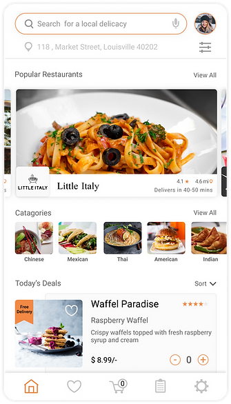
Home Screen
Home screen is the primary page of the app and so I designed it in an intuitive and simple way that contains all the important features to guide the user to rapidly navigate through the app.
I wanted the design to look clean, uncluttered and well categorized to provides all the key highlights on the home page.


Ordering & Checkout
The success of an app to large extent depends on how good the ordering and checkout experience is.
I decided to have as few steps as possible and placed the cart icon at the bottom bar for easy access. I also gave an icon for easy access to the orders where the user can check the current and past orders.
Takeaways
While designing the Local Grub app, I learnt that the first ideas of an app are just the beginning of the process. It is very easy to draw conclusions based on research but it is important to let the user lead us to the actual solution to the problem.
I also realized that testing early really helped me show the basic ideas to the real users and get important feedback which in turn helped me solve the user problems. Usability test and feedback influenced each iteration of the app's design.
Next Steps
Hi-Fi Prototype Usability Test:
1) Since the previous usability test was conducted with Low-Fi prototype it becomes essential to conduct the test with the final design too since it is closest to the end product. This will validate the purpose and need to the website from the user's point of view.
2) Build a Local Grub portal for the local restaurant owners to set up their profile.
Accessibility: I want the website to be accessible for everyone. I would like to test it with groups with disabilities and find out the problems they faced while using the website.